- GrowthCart
- Posts
- 4 Proven Static Ad Strategies from Leading Brands
4 Proven Static Ad Strategies from Leading Brands
Discover how top brands create high-performing static ads with clear messaging, strong visuals, and conversion-focused strategies.

Let’s talk about static ads—the ones without flashy animations or eye-catching motion graphics. Just a simple image with a strong message.
And yet, some brands absolutely crush it.
You’ve probably scrolled past countless forgettable ads today. But then there’s that one. It’s not loud, not over-the-top, but something about it makes you stop. Maybe it’s a sharp hook, a crystal-clear USP, or a simple review that instantly clicks—“I need this.”
Today, I’m breaking down some of the best static ad examples from top brands. No fluff, just real ads with messaging strategies that work. Whether you're running paid campaigns or just want to sharpen your marketing instincts, you’ll walk away with ideas worth testing.
Let’s dive in. 🚀
1. Static Image with Core Benefit
🔥 Killer ad by Curology!
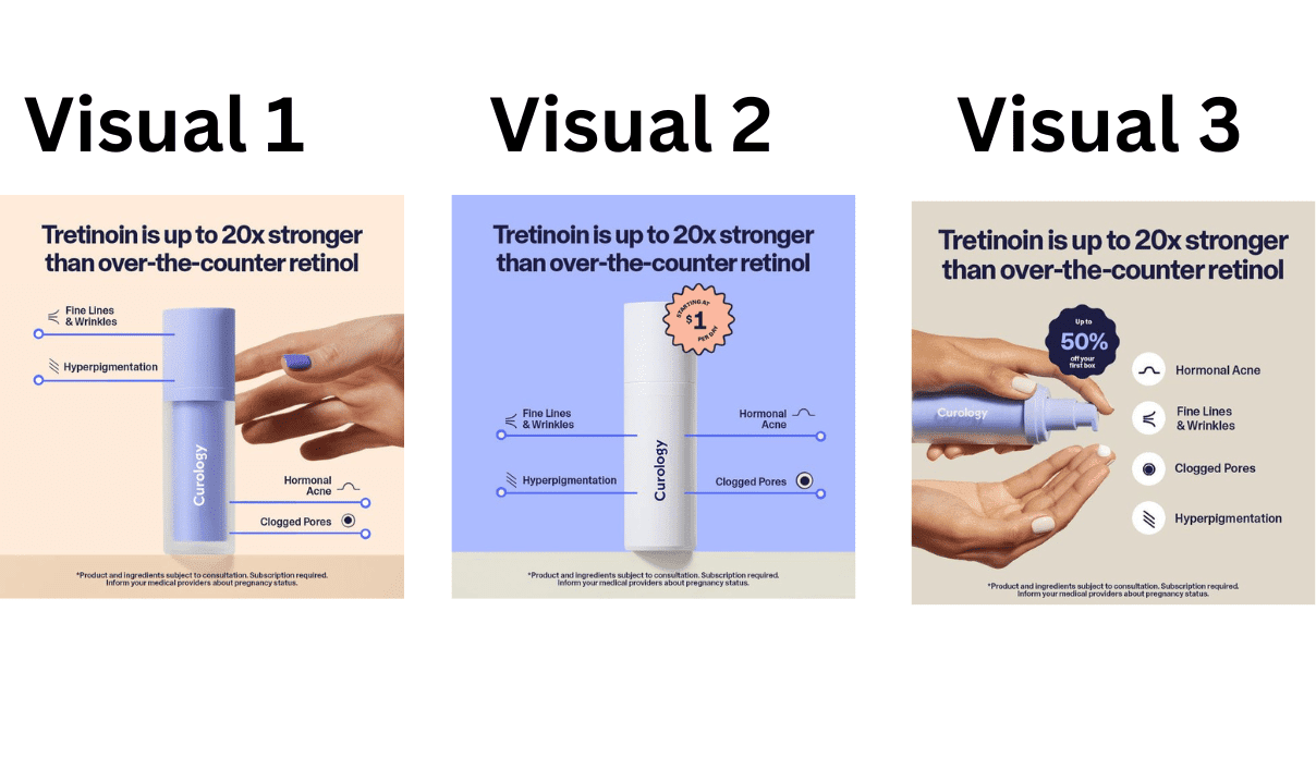
This ad doesn’t just nail the USP and core benefits in the headline—it also takes a smart approach to testing visuals.
Instead of changing everything at once, they’re running three versions of the same ad, keeping the headline and messaging identical while swapping out only the visuals.
🚀 Why this works:
✅ Isolates the variable – Testing one element at a time gives clear, actionable insights.
✅ Leverages a proven message – Rather than reinventing the wheel, they’re fine-tuning what already works.
✅ Scales efficiently – Once they find the best-performing visual, they can confidently invest more budget.
🔥 Brilliant static ad by Ecosa
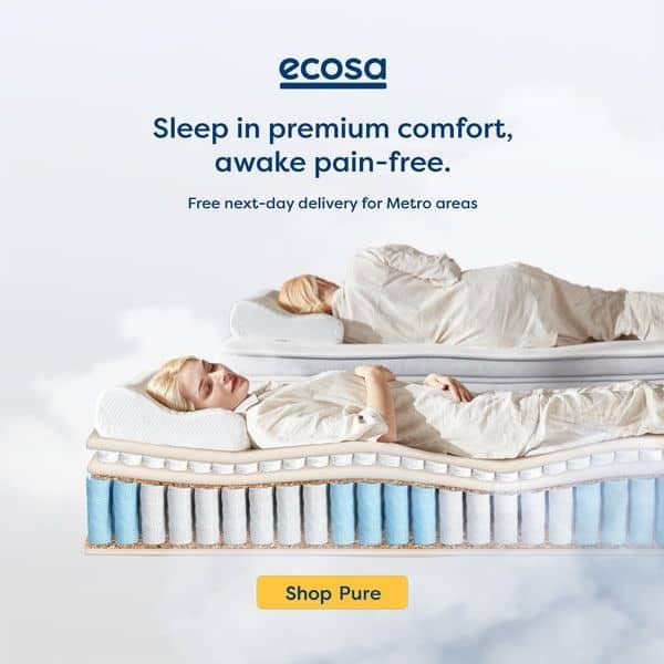
This is simplicity done right.
Ecosa keeps it clean—just the product, a sharp USP, and compelling copy. No fluff, no distractions.
🚀 Why it works:
✅ Shows, doesn’t tell – The product takes center stage.
✅ Strong USP – Clearly communicates what makes it stand out.
✅ Less is more – No over-explaining, just a direct, effective message.
🔥 Brilliant ad by Huel
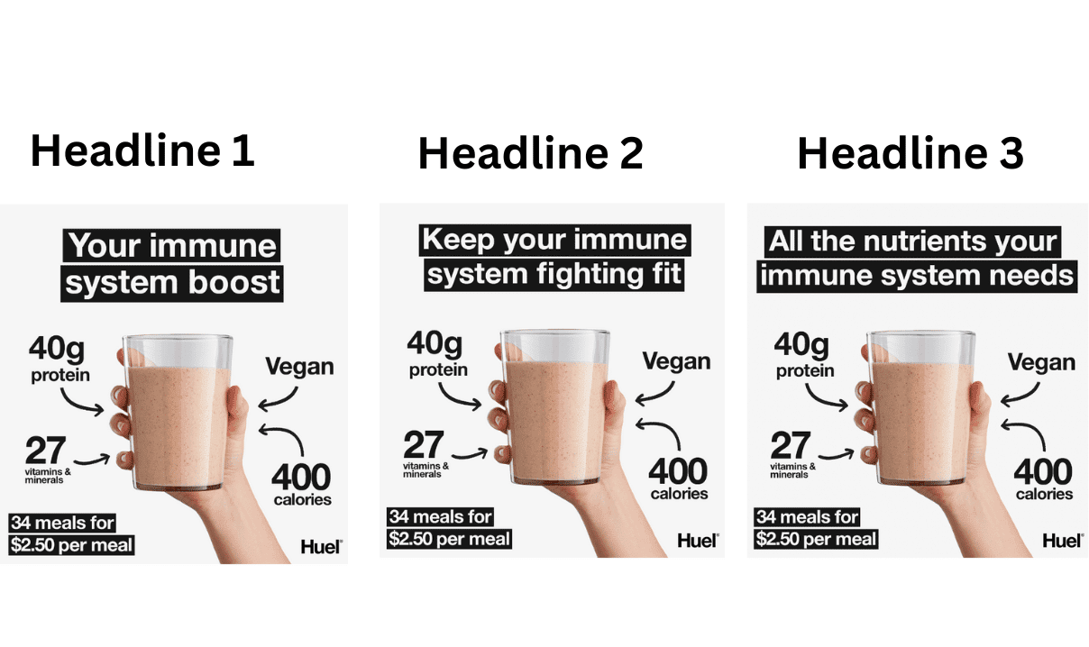
This isn’t just a solid ad—it’s a masterclass in headline testing.
Huel nails the USP and core benefits in the headline, but what’s even smarter? They’re running the same ad with three different headlines to see what resonates best.
🚀 Why this works:
✅ Keeps testing focused – Changing one element at a time provides clear insights.
✅ Finds the best hook – Different headlines tap into different emotional triggers.
✅ Boosts performance – Once they identify the winner, they can scale quickly.
Accomplish More. Juggle Less.

When you love what you do, it can be easy to take on more — more tasks, more deadlines, more hours – but before you know it, you don’t have time to do what you loved in the beginning. Don’t just do more – do more of what you do best.
BELAY’s flexible staffing solutions leverage industry experience with AI systems to increase productivity without sacrificing quality. You can accomplish more and juggle less with our exceptional U.S.-based Virtual Assistants, Accounting Professionals, and Marketing Assistants. Learn how with our free ebook, Delegate to Elevate, and leave the more to BELAY.
2. Static Image highlighting USP’s
🔥 Obsessed with this ad by Ridge
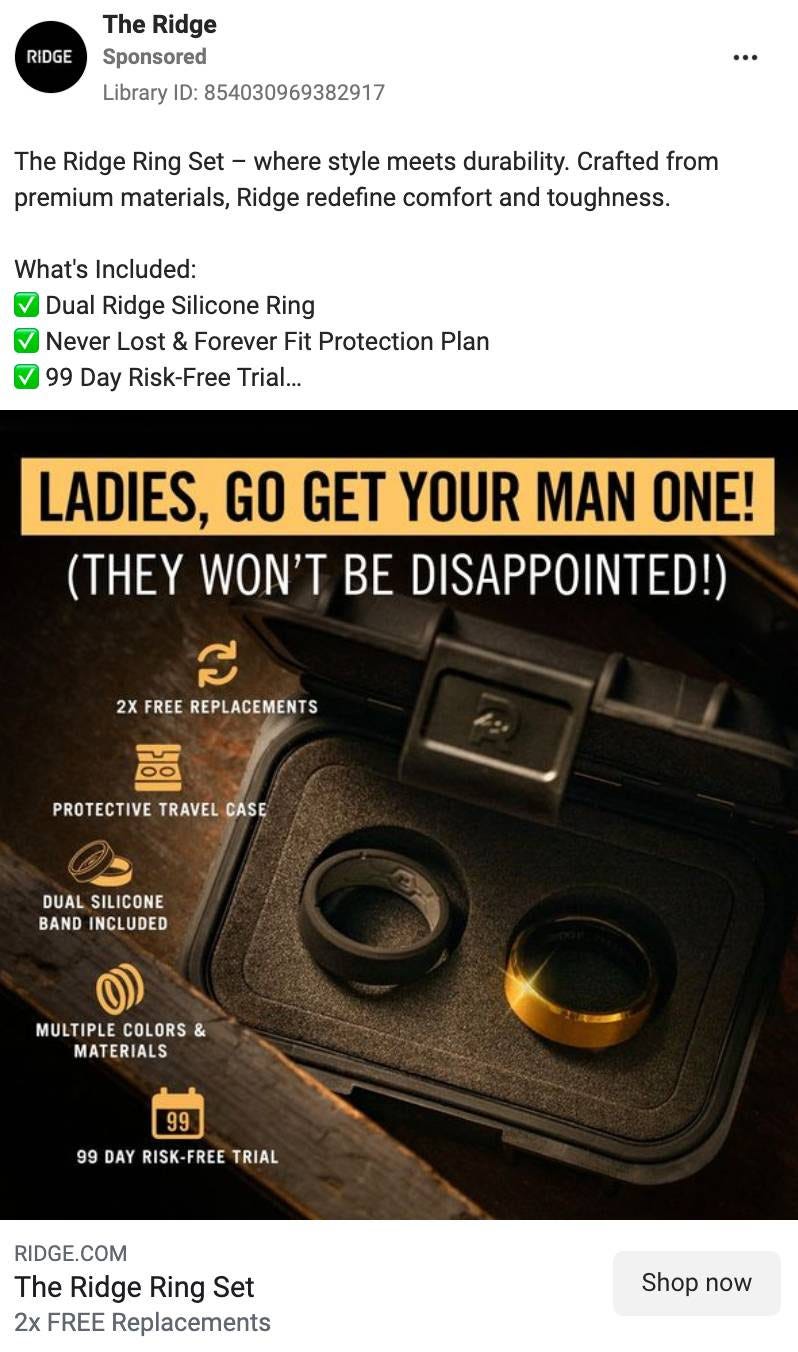
One of the smartest ways to scale? Target buyers who aren’t your typical customers—but are likely shopping for someone else.
Ridge nails this strategy.
Instead of only marketing their sleek, minimalist wallets to men, they craft ads that speak directly to women shopping for their partners.
🚀 Messaging: “Ladies, go get your man one! (They won’t be disappointed.)”
It’s short, playful, and effortless. No over-explaining, no fluff—just a simple nudge that taps into the universal truth: women often make gift decisions for the men in their lives.
Why this works:
✅ Positions the product as the perfect gift – Makes it an easy choice.
✅ Casual, conversational tone – Feels like a friend’s recommendation.
✅ Shifts focus from features to purpose – It’s not just about what it is, but why it’s a great buy.
A solid reminder that sometimes, the key to selling isn’t convincing the customer—it’s convincing the person buying for them.
🔥 Brilliant ad by Naked Skin
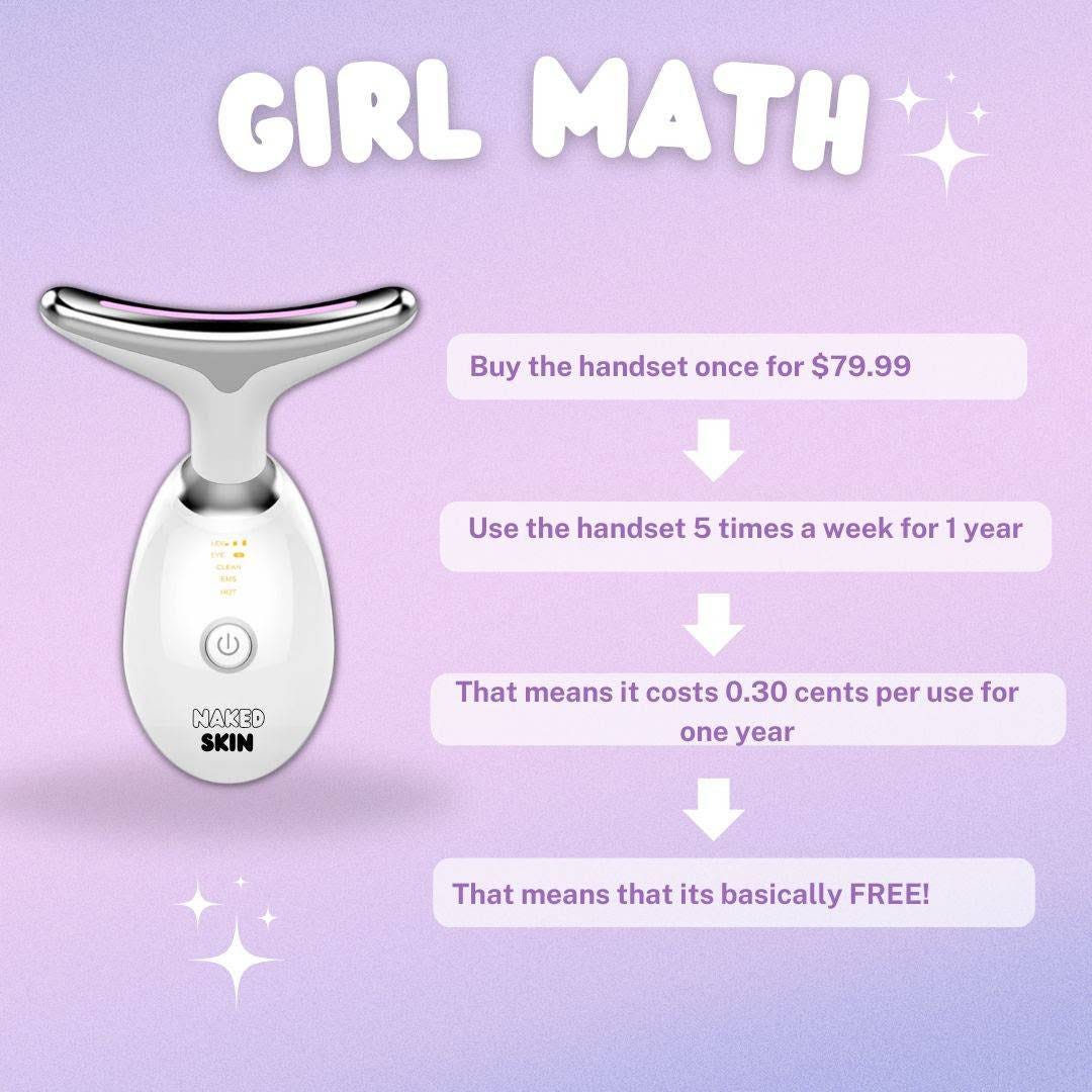
This is how you make pricing feel like a no-brainer.
Instead of simply stating the cost, Naked Skin flips the script with some clever “girl math.” 🧮
🚀 Messaging: “Girl math → Buy the handset once for $79.99, use it 5 times a week for a year… that’s $0.30 per use… which means it’s basically free.”
Genius. It transforms a $79.99 purchase into what feels like an absolute steal—no discounts, no gimmicks, just smart pricing psychology.
Why this works:
✅ Reframes cost as long-term value – Makes the price feel minimal.
✅ Taps into a trending concept (“girl math”) – Instantly relatable.
✅ Feels conversational – More like advice from a friend than a sales pitch.
The takeaway? You don’t always need a price cut to drive conversions—sometimes, it’s all about how you frame the cost.
🔥 Brilliant ad by Fulton
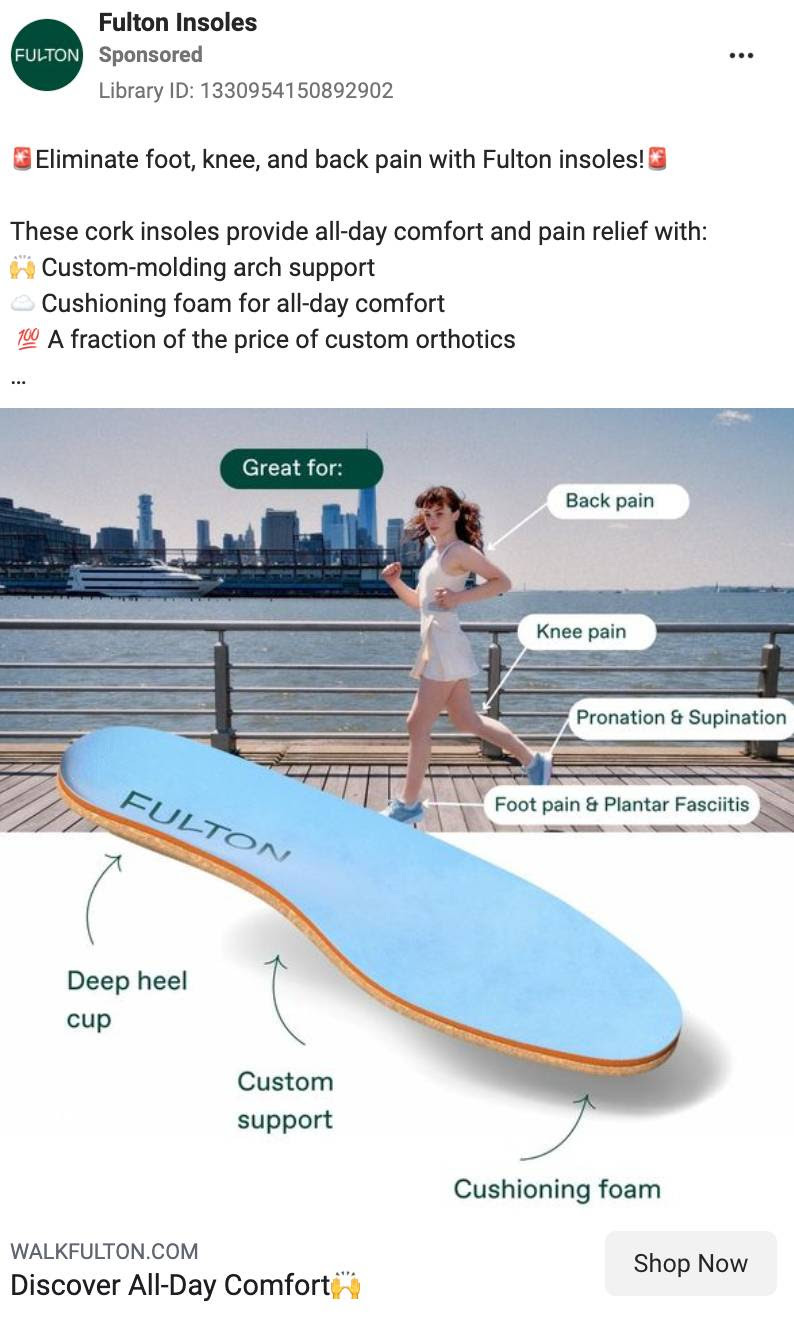
Static ads can be incredibly effective—if they deliver impact in a single image.
Fulton gets this right by clearly showcasing their product’s USPs and benefits in a way that’s instantly digestible. No fluff, no distractions—just pure value.
🚀 Why this works:
✅ Clear & concise – No guessing; the value is immediately obvious.
✅ Easy to scan – A quick glance is all it takes to understand.
✅ Visually structured – Each benefit stands out, making it effortless to absorb.
3. Static Image With hook

Later is a social media management tool that also helps brands connect with influencers. In their ad, they cleverly leverage a modern anxiety and offer a solution.
Why this ad works:
Nobody likes being ghosted or left on read—it's a modern frustration. This ad cleverly taps into that anxiety, framing it around the challenge of finding influencers for a campaign.
✅ Relatable hook – The image instantly triggers an emotional response.
✅ Clear solution – The caption steps in like the voice of reason, offering a fix.
✅ Seamless journey – The “Learn More” button leads to a landing page built specifically for this pain point.
Smart, targeted, and designed to convert.
4. Static Image with headline & review
🔥 Simple yet powerful ad by Ridge

A scroll-stopping headline + a solid review—sometimes, that’s all it takes.
Ridge keeps it clean, effective, and conversion-focused by letting the review do the selling. No over-explaining, no distractions—just strong social proof paired with a compelling headline.
🚀 Why this works:
✅ Attention-grabbing headline – Instantly makes you stop and read.
✅ Trust-building review – Real customer words create instant credibility.
✅ Minimal yet high-impact – No fluff, just what matters.